
Over the past while a number of readers have expressed an interest in seeing more information that deals with post processing. Many readers were looking for some details on how I combine the use of DxO PhotoLab, CS6 and the Nik Collection. While there was insufficient interest to create a dedicated eBook on the subject, we will be producing a few articles to outline the basic post processing approaches we take with various subject matter. This article discusses the various steps I took working with a sample landscape image.

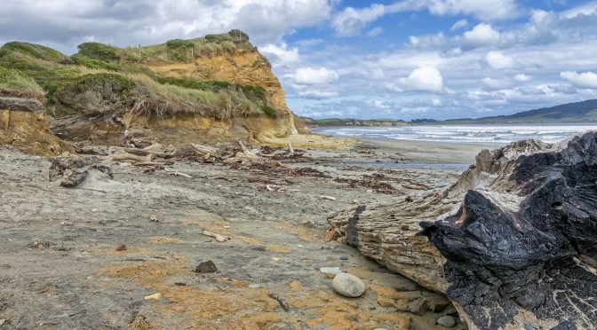
Like all of you, the first thing that I do when reviewing an image is develop a quick game plan in terms of what needs to be done in post. As you can see with the image above there is a reasonable amount of sky details that can be enhanced. The piece of driftwood in the corner provides some interest and depth but to really add value visually some work will need to be done to the shadow areas. Even though they look muted in this uncorrected jpeg, you can see there is a decent colour pallet in the image. This includes oranges, greens, a touch of dark red, and a range of brown shades. To make the most of the pallet I’ll need to make the colours pop as well as accentuate the colour tones.

I typically don’t do that many adjustments when using DxO PhotoLab or OpticsPro. In the jpeg above I allowed PhotoLab to make all of its automatic lens adjustments. I took Highlights to -20 to help thicken up the sky and took Shadows to -20 to begin the process of working in the dark areas of the corner driftwood. I used the auto setting for micro-contrast which resulted in a correction value of 16. I also applied PRIME noise reduction, which is something that I do with all of my images regardless of the ISO at which they were captured.

Before exporting a DNG file from PhotoLab into CS6 I always investigate using the Spot Weighted adjustment with DxO Smart Lighting. For landscape images I typically draw a large box over a good portion of the sky, then draw a second Spot Weighted box over an important element in the image. In this case it was the dark driftwood in the bottom right corner. If you toggle back and forth between images 2 and 3 you will notice some improved details in the sky and the driftwood. At this point I would export a DNG file into CS6 for the next set of corrections.

Since I shot the original image in strong sunlight I knew in advance that I would need to be pretty aggressive with my adjustments in CS6. In the case of this image I took Highlights to -100 and Shadows to +100. As noted in The Little Camera That Could, I often ‘double bump’ the highlights and shadows with my Nikon 1 images as this helps to compensate for the limited dynamic range of 1″ CX sensors. I also took the Black slider to -65 and adjusted Vibrance to +10. Increasing the intensity of the Black helps the colours to pop, as does adding a touch of Vibrance.

I always take a quick peak at the Curves Options in CS6 to see if one of them will help my image or not. In this case I used the Enhance Monochromatic Contrast option. This helped to give the colours a bit more pop and separation.

At this point I move into the Nik Collection for some quick finishing touches. With this particular image I used the Polarization adjustment in Color Efex Pro 4 with a rotation setting of 62, strength at 78, shadows set to 0, and highlights set to 100. Every landscape image is different and requires some tweaking to the Polarization settings to achieve the look desired.

The last adjustment that I often do with a landscape image is in Vivenza2, one of the programs in the Nik Collection. Typically I made minor adjustment with Contrast (often no more than 6) and Structure (often no more than 20). This helps to tweak edge acuity which makes images look a bit sharper. At this point many images are finished. Sometimes I will make two additional very minor adjustments.

The first of these very minor adjustments to to change the Levels setting in CS6. In this case I tweaked it to 0.95 which slightly darkens the overall image.

Depending on the image I may also make a slight adjustment to the Brightness setting in CS6. In this case I moved the Brightness to 8.
Since I’ve broken the adjustments done into quite a few jpegs to show the impact of individual adjustments it may look like this image took a fair amount of time in post. From start to finish it took 3 minutes and 18 seconds, including computer processing time.
No doubt there are many different post processing approaches that can be used with any given image. As long as a photographer can achieve their desired results, I don’t think it makes any difference at all what programs and adjustments someone uses.
Technical Note:
Image was captured hand-held using a Nikon 1 J5 and a 1 Nikon 10-100mm f/4-5.6 @ 11mm, f/8, 1/250, ISO-160
Word of mouth is the best form of advertising! If you like our website please don’t be shy about telling your friends and associates about it. Linking to this site or to specific articles is allowed with proper acknowledgement. Reproducing articles or any of the images contained in them on another website is a Copyright infringement.
My intent is to keep this photography blog advertising free. If you enjoyed this article and/or my website and would like to support my work you can purchase an eBook, or make a modest $10 donation through PayPal, both are most appreciated. You can use the Donate button below. Larger donations can be made to tom@tomstirr.com through PayPal.
Article and images are Copyright 2018 Thomas Stirr. All rights reserved. No use, duplication or adaptation of any kind is allowed without written consent. If you see this article reproduced anywhere else it is an unauthorized and illegal use. Posting comments on offending web sites and calling out individuals who steal intellectual property is always appreciated!
Great article. I’m surprised you’re not using ClearView within DXO. I find it’s combination of haze removal and midtone pop to give nice results. Love your site!
Thanks for the positive comment Preston – I’m glad you enjoyed the article and my site! I do use ClearView from time to time depending on the nature of the image. It isn’t an adjustment that I use that frequently as I find it a bit aggressive for my taste…but that’s just me. I know a lot of people really like ClearView and use it quite a bit.
Tom
Hi Tom
Thanks for a great article. I have read your little camera ebook and all your articles on post processing and now trying to learn your workflow as I have not done any post processing.
I downloaded a trial copy of DXO photolab and made your V3 Bird preset and generated a dng file. Now photoshop CS6. The adobe creative cloud is a way to access photoshop and lightroom for $9.99 month basic package. But there is also photoshop elements a light version of photoshop and lightroom without the long learning curve. It has a trial period so I downloaded it. From what I have read seems you use very basic photoshop functions for you post processing so i was wondering if the elements version may do the job. When I open the dng file with photoshop elements is see sliders for highlights, shadows etc like you talk about then from there pressing an open button brings photoshop tools and access to the nik collection which I loaded with elements. Is this something like you see when using CS6? Though I would try this before subscribing to CC. An article on post processing
birds like the landscape one would be very useful. Thanks again!
Hi Doug,
We certainly appreciate your loyalty as a reader, and I’m glad you enjoyed the article and found it helpful!
I’ve never used PhotoShop Elements so I can’t comment on that program specifically. From what you describe, it sounds like what I see when I use CS6. PhotoShop Elements likely has the functions in it that the majority of people would need for their post processing.
Tom
Thank you Tom.
Previously I was able to improve my BIF shots after reading some of your articles. And this article is definitely helping me already to tweak my images to get better result.
Only my NIK software has become quite unusable and does not work with Photoshop CC. So I uninstalled them. I remember your advice in another article about keeping the software with a non updated version of Photoshop but I cold not maintain that. Hopefully DxO lab will release a working version of NIK soon.
Many thanks.
Hi Bijan,
I’m glad that the article has been helpful for you! I’m not up-to-date on the latest versions of Photoshop so there may be some adjustments available in your program that may allow you to make similar adjustments without the use of Nik. I like the Polarization function as I can make skies look a lot more dramatic without seriously affecting other parts of the image. In terms of the Structure adjustment I view this as a tool to impact edge acuity, thus enhancing perceived sharpness. There may be something in PhotoShop that you can use in a similar fashion.
I visited your 500px.com site and must say that you have some truly wonderful images Bijan – I very much enjoyed viewing them!
Tom
That is quite a difference between the first image and the final one. I found it easy to compare by clicking on the last one, then using the arrow key to go forward, and then the reverse arrow key to go back. Sliding the image around on screen to see and compare the sky, or ground area.
I would still wonder how close you could get to the final image by only using PhotoLab. A challenge to you?
WEJ
Hi William,
I’m glad that you found the article of interest. I think someone who was very adept using PhotoLab (or OpticsPro) could produce a very good quality image using just one of those programs. My skills with the programs are somewhat limited. No doubt there is a huge number of regular PhotoLab/OpticsPro users who could run circles around me with those programs. Being a self-confessed ‘lazy post processor’ I’ll need to decline the challenge. At this point I have an easy-to-follow 3-program process (at least in my old, porous brain) that works for me, getting my images to where I want them pretty quickly. Learning new software has never been a personal strength.
Tom
I can dig that. That is why I like DxO so much. I find it easy to use, as opposed to all the stuff in Photoshop and other such programs. I also like that I can load multiple photos at once, apply a bunch of global changes, and then just tweak each photo before starting a batch process.
For me I now “three-step” in DxO. First pass is tilt and crop (plus keep or delete, or Viewpoint adjustments), second pass is Smart Lighting (regular or spot weighted), and final pass through I use for tweaks to Selective tone, Clearview and Color accentuation (and, on a few photos, Local adjustments). I find that doing this means a lot less time moving the mouse. After processing, I may rework one or two in a batch, or even delete some more.
Your using a Smart Lighting box on the sky is something I have not tried, but will to see what happens. I normally draw such boxes on dark areas only.
WEJ
Hi WEJ,
If you are looking to bring out more details in the sky placing a Spot Weighted box on a lighter portion of it can be very helpful. For other subject matter I often only use Spot Weighted box. Where I place it really depends on the nature of the image and where the adjustment will yield the best results. For example, with bird images I find placing a Spot Weighted box on a bird’s wings, especially on lighter or mid-tone feather details on the underside can really help add some definition.
Tom